Well, maybe just a little unveiled. As I promised, it’s time to start pulling the covers off of RootsMagic 4, but just a little at a time. So let’s start with the teeny tiny new features, and we’ll work our way to the super-duper new features in the coming weeks. Today I’m just going to show you the main screens in RootsMagic 4. There aren’t a lot of differences because if it ain’t broke, don’t fix it. But there are a couple of small things we’ve added to simplify things a bit.
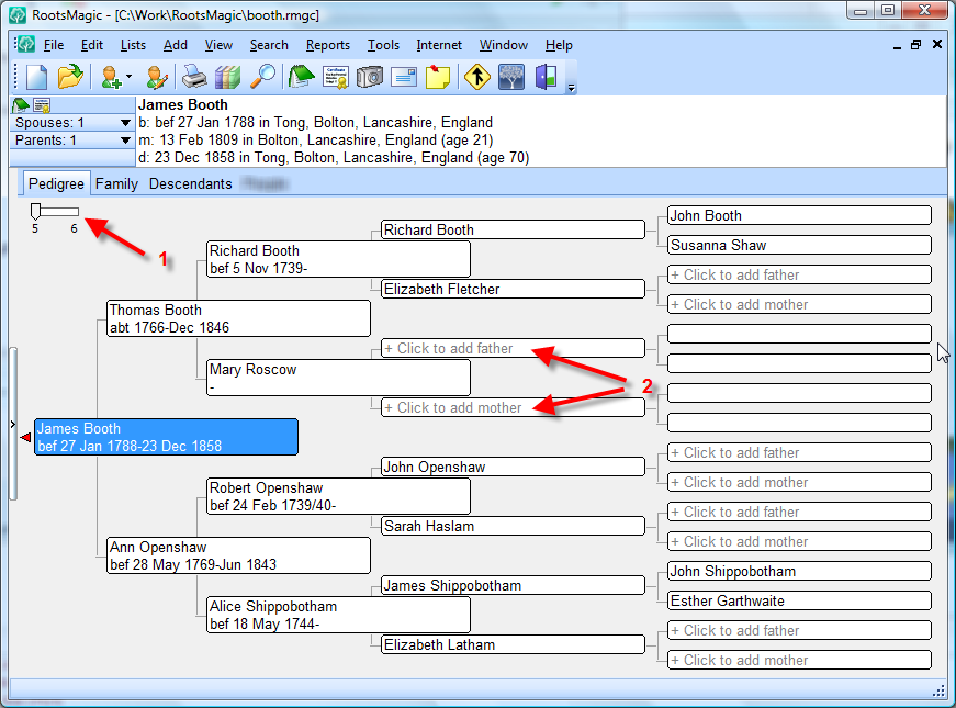
So if you clicked on the screenshot above so you could actually see it, you noticed 2 small changes. Number (1) is a slider to let you switch between 5 and 6 generations on the pedigree chart. Now we’ve let you do that in the past, but a lot of users never knew it because it was buried down on the status bar. And number (2) is a feature a lot of users (especially beginning ones) have asked for. I think it is probably self-explanatory.
Oh, and by the way, you should probably ignore that little blurred out tab next to the Descendants tab. It’s too cool for this early in the show (I told you I was a tease).
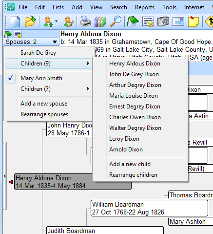
We have updated the little info area to the left of the highlighted person’s name. Now when you click on the Spouses button you not only see the spouses and children, but you can also 1) add a new spouse, 2) add a new child to a family, or 3) rearrange the spouses or children. Yes, you have always been able to do these things in RootsMagic, but now it’s a little easier.
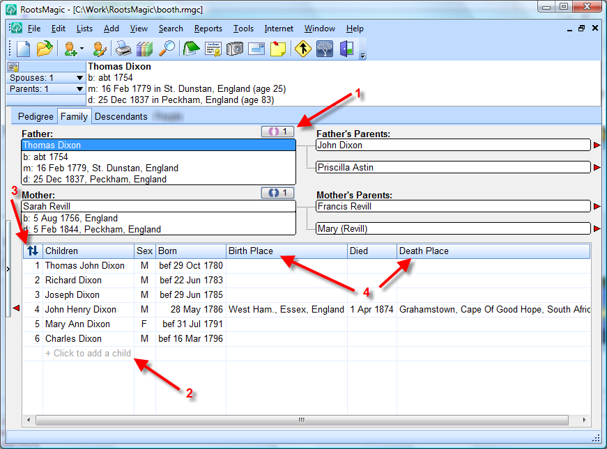
On to the Family View. Once again, little additions to make navigation and adding / editing data easier. Now you can always see exactly how many spouses each parent has (1), and clicking the button will let you switch spouses or add a new one. As in the pedigree view, you can add a new person (2) by clicking right where the person will go. Number (3) brings to the screen one of the most hidden features in version 3 (yes, we know it was hard to figure how to sort those kids). Just click the little sort arrows and you can immediately rearrange the children in the family. And finally (4), we heard you and have added the birth and death places, as well as optionally showing each child’s relationship to their parents.
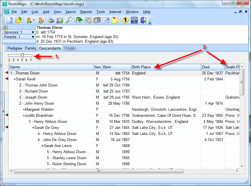
The descendant view looks and works just like in version 3, with the addition of the generation slider (1) and the addition of the birth and death place (2) columns.
So there you have it. The tiniest enhancements we made in RootsMagic 4. But those with eagle eyes might spot several hints of other changes on the main screen that we didn’t talk about. So keep checking back. It only gets cooler from here.
�


Well, that settles it. I’m already in love with the rootsmagic4.
Thanks for the updates!
Such simple ideas will make our lives so much easier. However, I think you having too much fun with this teasing thing – blurring bits of the main page indeed !! 🙂 Well done, and thanks for the updates.
So far so good, but I’m still hoping that you grant my biggest wish. That is to please accept christening dates and burial dates as birth and death when the actual birth an death dates are not available. That would mean that in the family view, for example, in the birth field it could say (chr) 20 March 1847, and in the death (bur) 14 May 1896. That would really help for sorting.
Regardless, RM is still far better than all the other genie programs that I have tried. Keep up the good work.
Penny, that is already available in RootsMagic 3. If a person has a christening with no birth, or a burial with no death, it will display the chr / bur in their places in most spots. Is there an area you aren’t seeing this?
Bruce, these are great! These “teases” are a fabulous idea, and I can’t wait to use RM 4. I especially appreciate how you’re making it easier to add/rearrange spouses and children. And you’re right about not noticing the option to view the pedigree in 5 or 6 generations: I’ve had RM 3 from the beginning and just discovered it last week, by accidentally clicking on it!
Looking forward to more posts!
Thanks, Bruce:
1. I would guess that some folks don’t always have the status bar turned on.
2. Will “click to add [parent]” in the empty box be replacing the Add tab and/or icon?
Blurrrrrrrr…. Bet someone will guess right off what this addition is all about, though it won’t be me – too bad!
RM4 looks fantastic can’t wait to get my hands on it. RM is by far the best program I have used. Keep up the good work.
Glenn, the Add toolbar button and menu will still be in version 4. This is just an additional way users can add people if they want.
I am so excited for the RM4. Maybe a blog giveaway when the time comes? hint hint. I can’t wait;-)
WOW, Bruce
Imagine a great big smiley face!
Laura
Well just hurry up with the release!!! LOL
Bruce, I am so excited – can’t wait for RM4. WOW!!!!!
I think the blur is for “Individual”. No new window, just a tab page for individual entry.
“coming weeks” !!! Groan! 😉
Good teasers 😉
Can you speak to the “anticipated” delivery timeframe any more precisely?
THAT’s the *BIGGEST* tease, LOL!
Coming Weeks? How about ‘Available for order on ——– ‘
And I thought there was no way Bruce could make the main screen any better than it has been! Bravo! I can hardly wait to see the rest.
Oh WOW ! Bruce, I will be busy for a year learning all these wonderful new features. I hope those in out Society decide to buy the Manual and read it this time. 🙂
Let the games begin, I will be loving working with this soooo much.
Again, you are very creative and can hit a homerun with such endeavors and More to come. Will wait, but it will be hard.
Herb M…
A wish come true!I now find the Family View far more informative with both birth and death dates with places for the children. Well listened and done.
The changes you’ve described look great and I’m looking forward to getting RM 4. I hope you’re making some changes to the printing options too. Printing a good looking report with the facts I want and in the order I want for 3-4 generations has been very tedious in RM3 and I just hope there are some improvements coming in that area. I’ve had little luck with preparation of Custom Reports if I want more than a couple of facts. The Custom Report option does not work for me as easily as your instructions imply.
Thanks and keep up the good work!
Mary
Great Job, Bruce. One question – Will we be able to turn off the “click to add (parent)” from appearing on the screen? I just look for the white spaces. I also do a lot of screen prints and that may just add clutter.
Can’t wait to see the whole program.
Will sync capabilities with new FamilySearch be included when RM4 is released or will they be added later?
Gary, it kind of depends more on NFS itself. We will release RM4 when RM4 is ready. If the NFS API itself is ready for prime time by then 4.0 will support it. If not, it will be in a free update to 4.0 a short time later.
The initial screen shots and preview of the interface features look great Bruce! I am looking forward to getting RM4!
A couple things.
With the ‘white rectangular’ area where it shows the persons name, b:, m:, d:, it somehow just doesn’t flow with the 3d look of the Spouses and Parents buttons. Don’t know if it would help or is possible, but maybe give it a more “beveled” look around the edges to make it look like it’s “inset” or depressed. (OK, this is a really minor nitpick, but what the heck.)
I assume if you have a photo assigned to an individual it will still show on the screen next to the Spouses & Parents buttons?
And of course I’d be remiss if I didn’t harp on my favorite pet peeve of being able to include the ‘divorce’ info in Descendent List report. This report would benefit greatly from having an option to display the B:, M:, D:, and Divorce info, but don’t break them out into invidivual lines. (This wastes way too much paper.) There needs to be an option to put all this on one line and simply “wrap” the line if needed. (The line wrapped should match the indent level and not automatically go to the far left border too.)
I know you didn’t want to hear this last item, but this one report is the only reason I still use FTM as it has the best descendant list report out of all genealogy products. Anyway, bravo on the new look and enhancements you’ve shown. They will be very useful to everyone and I think RM4 will sell like hotcakes!
Keith, have you looked at the descendant box chart reports? It allows you to wordwrap each descendant’s information as you describe. If you don’t like the boxes you can set the box style to no boxes.
As a very early user of Family Origins and every Roots Magic so far, I am amazed at how far the program has come. I am so looking forward to RM4. There is one change I would welcome. Many people change their surnames (especially Slavics in my tree in the early part of century). I would like to be able to find them in SEARCH by their Slavic name AND by their Anglicized name. In other words they would appear twice in SEARCH. With over 100,000 names I can’t remember all the changes when searching for a person. Adding “Also Known As” does not add that surname to the SEARCH function. The trick would be not to have that person count twice! This change would help some of us immensely – especially me!
Bruce,I really love the look so far and I think your idea to tease us is wonderful, you really know how to build up the suspense. Get ready to be “snowed under” with people wanting RM4. I sure hope you will have plenty of copies on hand when you release it!. Well done! and thanks for all your hard work.
Dear Sir,
I use RootsMagic for purposes of following my genealogy for LDS church purposses. I have enjoyed the feature that allows me to download the temple data from “familysearch.org”. I now understand that “familysearch.org” will be changing as “new.familysearch.org” comes on stream. My question is, will version 4 allow access to this “new.familysearch.org” as it comes on stream. I do not want to loose this feature. I believe that RootsMagic is doing a very good job and request that you keep me informed as to when I can purchas your update. I am hopping it will be reasonable in price.
Thank you
Richard T. Cotton
Tom, yes, we will be supporting New FamilySearch.
I think I might know what the blurr is and if I am right is is linked to a wish posted some time ago. I do hope it is contextual to what generations are currently being displayed on screen, that would be really cool.
I hate rushing the summer but I can’t wait for RootsMagic 4 to be available! Keep up the teasing – tell me more! 🙂
Further to Penny Holt’s request (see comments 3 & 4) it would be very helpful if when creating a new person record with RM that the Date of Baptism be one of the prime entry fields. The rational being that when working with parish records this information is given but often the date of birth is not. Today when a generation of children is found in say a particular parish record it is necessary to keep moving into multiple screens to enter this basic information.
Thanks,
I’m in work on a break, reading the blog and running RM3 from my USB pen. I carry all my data on the USB pen while away from home including the program files so I can do a bit of editing on my breaks.
Then I got to thinking “What if RM4 will not run the same way”, can you please put an end to my uncertainty and worry Bruce.
Type your comment here.
Will the new Roots Magic include spouses of brothers and sisters in the Narative Report? That is very much needed.
I am also eagerly looking fwd to RM 4.
I do wonder though, is RM 4 available to run in Apple Mac? Or is it just for PC use.
I used to be able to try to do a place names report for B.M.D, data but since importing FTM files it picks up too many of fact fields making it virtually unusable to take a place report to a library for convenient researching.
Any suggestions?
This is something someone noted on another blog.
Look at the toolbar. See the dots at the left edge and the little triange on the right?
My guess:
Open up any of the Microsoft Office products. The 3 dots are a handle, a place to click and drag the toolbar. It allows you to reposition it and usually detach it, placing it anywhere on the window.
The down pointing triangle is usually a toolbar customization menu.
Since we are into guessing, I know I would like the little fuzzed out new tab to be a to-do tab which is specific to the generations presently being viewed on screen, in other words if you are viewing on the family screen pressing this button would display currently open to-do’s for that family, same would apply if you were in pedigree mode only obviously it would cover more people. This would be a great new level in to-do management.
I have been hoping for a big makeover to enable better management of to-do items on screen for years with more sub categories to sort and select from.
Although I am eager to get my hands on RM4 I can live with a lot more disclosures before then and so far with the third revelation it is looking great.
Bruce, I think the 3rd post by Penny refers to the fact that when you are arranging the children, the christening date is ignored. Ie: if I have children born: 1795, 1797, 1801, 1803 & I have a child with no birth but a christening of 1799, the christening will sort to the top, if I click the “sort by birthdate”. Now I can manually sort the children into the correct order, but as the christening dates don’t show, you have to look behind the sort box, or remember the order you want them in.
I would like to be able to print to paper the view I get on the screen when I switch to Descendant view, just as it shows on the screen. Is there any way to do this in either RM 3 or RM 4?
I like these new features of the Family View screen. I’ve got my credit card in my hand! 🙂
In the family view, I would like a column for “Age” that would display how old the person attained in their life. I do see this information by clicking on each individual and looking in the header area but that’s a one-at-a-time view of the family.
In relation to this, another function I perform manually is to color code children who have died at a young age. My arbitrary cut off is 15 years old. I color the name in Gray so it becomes visually obvious there are most likely no descendants for this individual.
I want. How do I get version 4
I’ve been a long-time PAF user and wanted to covert to RM, but I have a problem. I primarily work on genealogy because of my desire to provide LDS ordinance work for my ancestors. Previous versions of RM do not differentiate, as PAF does, between LDS ordinances that have been submitted or cleared (bepsc) and ordinances that have been completed (BEPSC). This is a very important feature for me, The differentiation between the non-caps and the caps in PAF is significant and I have been told that this differentiation will be coming with RM4. Is that true? If so, sign me up for RM4!