I am at the BYU Family History Conference all week. But here’s a quicky for you.
If you’ve done much merging, you know that most of your time is spent staring at the screen comparing names, dates, and places. In RootsMagic 4 it is color to the rescue…
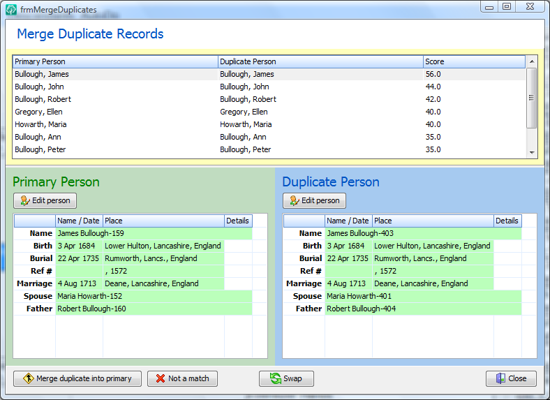
If you noticed all the green on the two possible duplicates on this merge screen, you may have realized that green means the fields match on the two records. So if you see a bunch of green, it means to don’t have to spend as much time comparing every field of the two records before making a decision whether to merge them. Now take a look at this one…
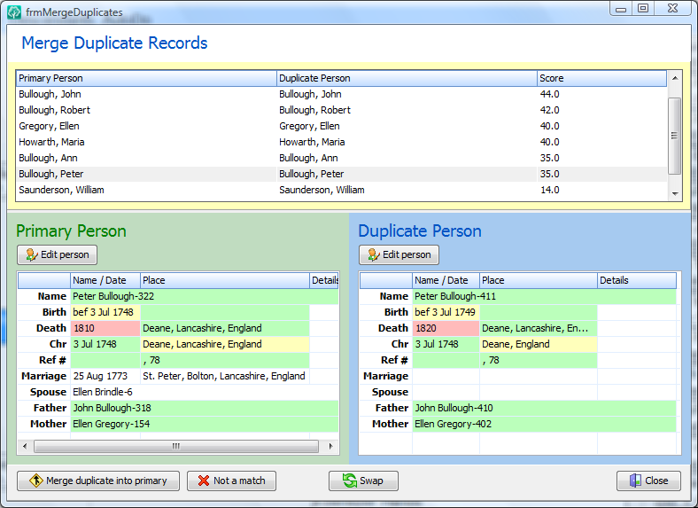
These possible duplicates have some yellow fields and a red field. Yellow indicates that the fields are close but not exactly the same, and red indicates they aren’t the same at all. So if you are seeing red, it means don’t waste your time comparing all those fields.
There are a several other areas where RootsMagic 4 uses colors like this, but we’ll let you have the fun of discovering those for yourself.


Gosh, every time you write a new post highlighting some new feature on RM4, I hear myself saying, “Ooh! Aah!” like at a fireworks show!
Good one Bruce and another very helpful addition to RM4. Various posts have mentioned resizeble windows and I hope all windows are resizable so we can overcome the truncated fields and scroll bars as shown in your screen shot.
Keep em coming and have a good week in BYU
John James
Ireland
I REALLY like this enhancement.
Personally, you can ship my copy today–even if it isn’t quite ready for primetime, I am perfectly willing to take version 4 today AS IS
All of the changes thus far described are sure to improve RM.
My hope is not that more “bells and whistles” will be added, but that all data for all 18K+ people moves over to the correct and corresponding locating in RM4.
Jack, I’m sure data integrity is foremost with Bruce, well over and above “bells and whistles” But just to be extra safe when I get a new version I run the old version alongside and make any changes to it while I experiment with the new one.
I’m wondering will RM4 get demo’d at the BYU Family History Conference this week then have the major features revealed when Bruce returns and maybe be ready for shipping shortly thereafter. Time will tell but either way it looks good so far and it cannot be far away from release.
John James
Ireland
This is a great innovation, and will be very useful. One question – in the example above would the death date be merged into the primary date, 2 seperate facts, or both dates shown?
Great idea which will make my life that little bit easier !
Very friendly appearance. A suggestion for consideration that immediately came to mind is to modify one heading to:
“(Possible) Duplicate Person” or
“Duplicate (?) Person” or
“Duplicate Person (?)”
The parents on both files should be yellow to indicate further study or merging of parents also.
In regards to using colours in RootsMagic 4 I hope you have taken into consideration all the colour blind people out there. Hopefully it will allow the user to change the colours to be user friendly for these people.
This sidebar being talked about…is it one I’ve missed in RM 3.6.x; or is the reference to the sidebar on the blog page?
Jack, I’ve had no trouble moving data from older versions to newer ones – and I started with data from FO6 and, earlier, PAF (which also imports well, although you may have to move suffixes to prefixes). If you’re *really* nervous, use Gedcom to export and import the file.
I hope that 4 will make it possible to search by loacation, bringing up every name that is recorded for that location.
After relook I just noticed the best feature for newbees. It is noting whuch one is Primary. Thanks!
Your color coding of individuals event dates and places will be a great help.
I have a very large database, over 2 million, I like collecting info on celebrities and well known people in history and have thousands of duplicates. I would like to have some additional help in merging:
1. Individual ID’s – It would be a great help to have a search requirement where you limit search matches to just matching ID numbers of parents, spouses and or children.
2. Auto merges – on all the time while you manual merge.
3. Surnames – have a “similar” or “sounds alike” and or soundex,
4. Family Name Prefixes – allow matches to ignore Von, Van, D’, De, Le, L’, La, etc.
5. Browse – allow view up and down the family lines from match dialog box to help prove the family matches and match other duplicate members.
6. Reports – have a box you can check to create a printable list
7. “Start with surname” – add start and stop like surnames from Dittmer to McCormick or D to M.
8. “SourceMerge” error report – It would be nice to have a report of glitches in my data base. Every time I try to run SourceMerge It hangs up some were and the program shuts down, exits out!
Steven McLaughlin
Santa Ana, CA
s.mclaughlin@att.net
I love the idea. However, I would like to make a plea for all of those of us out here that are color-blind (like my husband). Using red & green colored fields doesn’t help him at all (unless one is flourescent & one isn’t)! He will see no difference in the two fields… Please, rethink the colors. Thanks!
I love the color enhancement! I have multiple backup copies made over time, and for various reasons have become confused and updated different ones at different times (I know, bad file management, but there it is!). This will really help me sort them out and create a master file. My database isn’t huge, but 20 file copies with 2K+ individuals adds up!
Cheers, Kit.
Thanks for the color coding for finding duplicates. It is easy to remember…green= go, yellow=caution and red=stop. Great.